


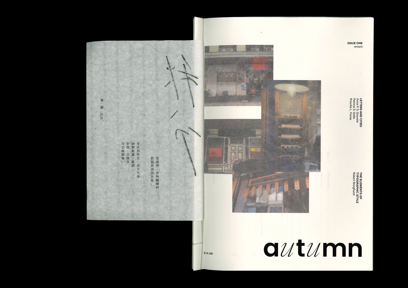
Autumn is a design magazine that aims to bridge the differences between English and Chinese typography and, by extension, bring more awareness and interest to Chinese culture.
This issue, remain, explores the familiarity and loneliness of being Chinese in a foreign city. Familiarity in terms of the Chinese signages and posters scattered throughout the city. Loneliness due to the disparity and constrast between Chinese and English typography.


paper: popular book pastel colour, 100 gsm
inserts: reflex sand premium paper, 80 gsm
flap & riso insert: richeson's rice paper pad
tracing paper: daiso 0.04 mmm tracing paper


margins
top: 60 mm
bottom: 15 mm
inner: 20 mm
outer: 15 mm
The low top margin is meant to resemble traditional Chinese books.


full magazine flip through


typographic style guide


☁ thanks for stopping by! ☁
。
。
。
。


